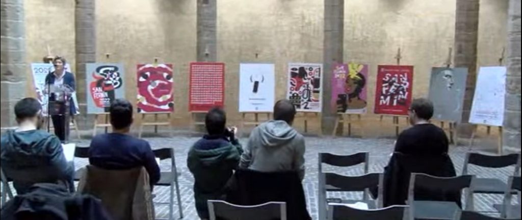
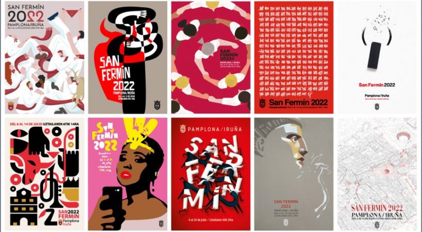
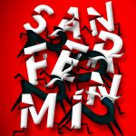
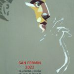
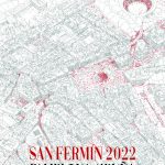
Among these ten works is the work that will lead the Sanfermin 2022 festivities, those of the return after the pandemic. A voting period is open until May 4, for which an exclusive participatory process is enabled for those registered in Pamplona and an exhibition so that the quality of the works can be assessed before making a decision. From Sanfermin.com we bring you the works so that you can make your decision without having to go there. In addition, we offer you a survey so that you can tell us which one you like the most if you cannot vote even if you are a very San Fermin person.
Choose your favorite poster for the Sanfermin.com survey
This survey does not decide which work is the best or the worst, but rather the one that those who read sanfermin.com like the most. You can vote for up to three works and see the result of all the people who have participated.
¿Qué cartel es tu preferido para Sanfermin 2022?
- 260 - Por fin de vuelta (19%, 31 Votos)
- 638 - La fiesta somos todos (14%, 23 Votos)
- 132 - 1087 (13%, 21 Votos)
- 27 - Beti bezala (11%, 18 Votos)
- 469 - Corre San Fermín (10%, 17 Votos)
- 52 - Emoción (8%, 13 Votos)
- 500 - Bendice la fiesta (7%, 12 Votos)
- 103 - Vuelta a la fiesta (7%, 11 Votos)
- 326 - Preparada (6%, 9 Votos)
- 167 - (2022) (4%, 7 Votos)
Votantes totales: 133
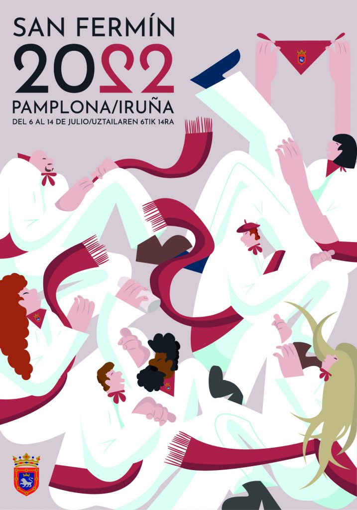
POSTER 1. BETI BEZALA
JURY ASSESSMENT
The aesthetics of the poster presents a personal “revival” of the posters of the 30s from a very current perspective. It has been selected for being a dynamic poster, with diversity in its participants.
It represents the essence of the party: people having a good time. There is dancing and joy. It is an image of people in movement and festive accompaniment.
They find the color very resounding. It is a good reflection of the power and quality that is currently in the illustration.
ARTIST PERSON COMMENTS
«This poster is made up of modernist figures that represent the multitude of the San Fermín festivities, as always, beti bezala, an aura of happiness and harmony of colors is generated».
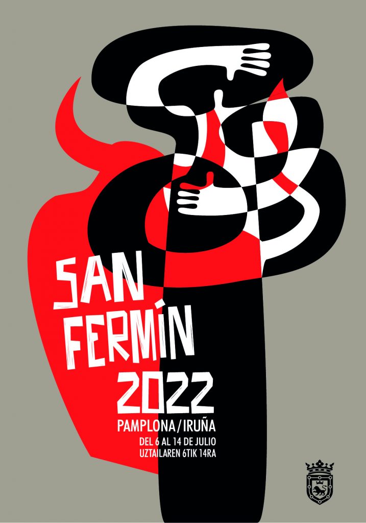
POSTER 2. EMOTION
JURY ASSESSMENT
The poster reflects well a moment of union, a very closed composition, in which the conjunction between the person and the bull is very intense.
The graphic treatment is very interesting. The aesthetic of the poster is reminiscent of avant-garde pictorial movements (cubism, constructivism…) and gives it a sculptural character.
From that style reminiscent of aesthetic avant-garde, he builds a current image. It draws you into the present with the strength of the manual typography and how it’s integrated into the poster.
ARTIST PERSON COMMENT
The fusion between courage, adrenaline, fear and emotion that is felt in each running of the bulls. The danger, the red bull, the movement of the lines every race. A hug to the essence.
POSTER 3. BACK TO THE PARTY
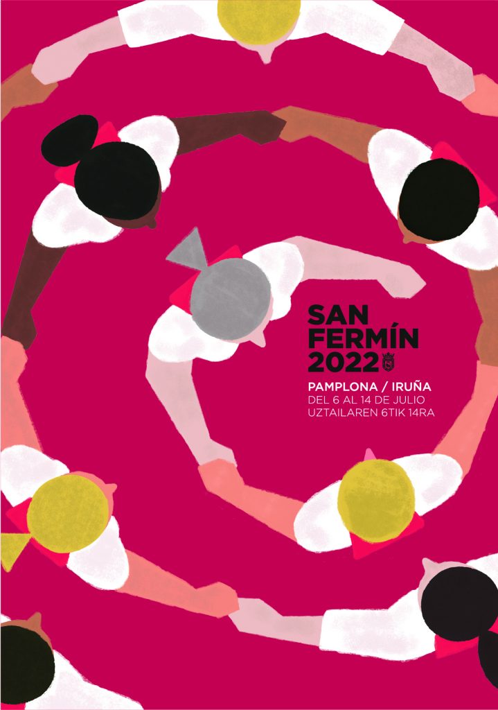
JURY ASSESSMENT
It is a very dynamic and friendly poster.
It transmits community, warmth of the company in festive moments.
Idea of ??dynamism.
Message of coexistence, communion, enjoyment, joy, diversity and equality at the same time.
Diversity in the homogeneous.
ARTIST PERSON COMMENTS
Dantzas and typical dances of Pamplona/Iruña, an intercultural festival, which involves everyone, without age limits. We want to go back to the usual parties.
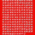
POSTER 4. 1087
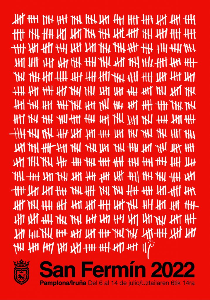
JURY ASSESSMENT
Technically an elegant, forceful poster. Very significant.
We all find days of suffering and days of confinement in those bars. Reminds the prisoner that he is counting down his days. It also reminds of fencing. It is a very wise poster.
It exquisitely reflects the three years of waiting. The bars are handmade and seek to break the rigidity of the concept. They generate dynamism.
An artistic element becomes a narrative. The narrative character achieved with graphic elements with the magnificent final wink converted into a festive txupinazo.
ARTIST PERSON COMMENTS
The poster shows the 1087 days that have elapsed from the last day of San Fermín in 2019 to the first in 2022 and ends with a small txupinazo that culminates the three years of waiting.
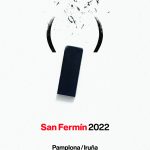
POSTER 5. (2022)
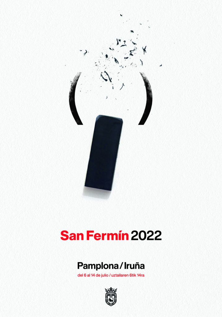
JURY ASSESSMENT
It reflects the parenthesis that we have experienced and how the holidays are going to erase it.
Very symbolic poster. Let’s erase all this past time and give ourselves to the party. Conceptually it is very interesting with a minimalist presentation.
The rubber physically has a reason, but so does the result.
Artistically it is very well resolved.
How with so little can something so round be done.
Very static in appearance, it actually provides the dynamism of a bull run.
Conceptual image on a white background that represents the image of a bull; with an eraser and the parenthesis symbol, alluding to the two-year suspension of the festivities (2020 and 2021).
ARTIST PERSON COMMENTS
Conceptual image on a white background that represents the image of a bull; with an eraser and the parenthesis symbol, alluding to the two-year suspension of the festivities (2020 and 2021).
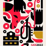
POSTER 6. FINALLY BACK
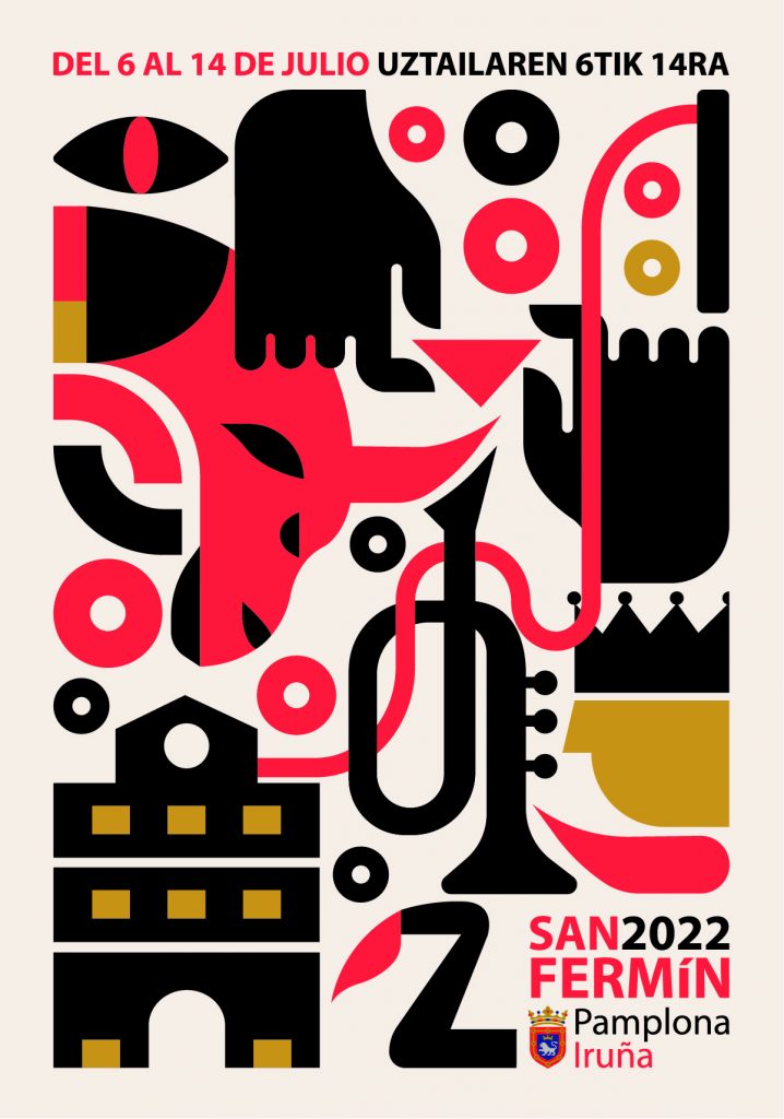
JURY ASSESSMENT
The graphic impact achieved with the use of only 2 or 3 colors is valued positively.
It takes various elements of the party to synthesize everything, homogenizing it with style and color in a varied and dynamic composition.
It challenges the viewer’s intelligence.
ARTIST PERSON COMMENT
Reflection of what was needed and has returned. Minimalist design reflecting important elements. The running of the bulls and the person as an essential component around the party are highlighted.
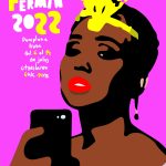
POSTER 7. READY
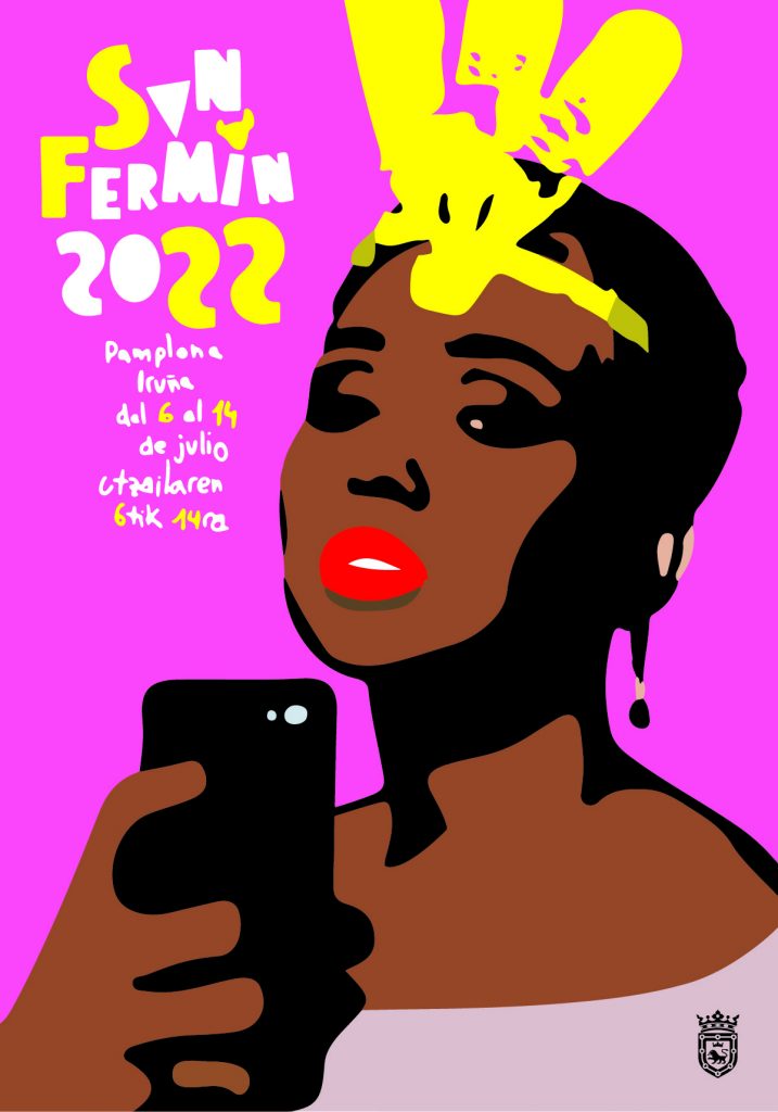
JURY ASSESSMENT
It offers a very striking image. Queen Braulia humanized and taking a selfie.
She seeks to humanize. Work a different perspective than the usual one of a giant. You don’t have to prepare her, but she prepares herself on her own. It values ??typographic work. Manual typography. The contemporaneity of elements such as color and mobile stands out.
It puts recognizable elements of the party with a very modern language of symbols, colors and languages. Unusual colors that give us a feminist look.
The choice of the giant is important. She is a woman and also racialized.
It is a current gesture (SELFIE) as an idea that it is the only way to attest today that you have been in a place.
The typography gives her a lot of dynamism and it seems that she is dancing. It brings us references to Andy Warhol’s Marilyn and Pop Art.
ARTIST PERSON COMMENT
Braulia is ready to go out dancing. Elements arranged from top to bottom and left to right. Handmade drawing and typography. Bright and neutral colors. Striking image.
POSTER 8. RUN SAN FERMIN
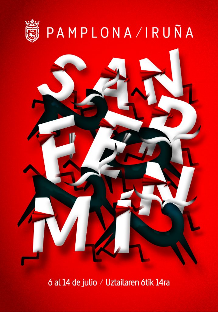
JURY ASSESSMENT
I would highlight from the poster that it goes to the most international concept we have of San Fermín: The running of the bulls. The numbers of the year are the bulls and the letters of San Fermín, the runners.
It does so in a fun way, a confinement of fonts in volume with the composition in which the message of San Fermín 2022 is integrated into the illustration itself.
Play with the elements. Create a composition that works and is readable, but at the same time is fun.
It could be a staff, it brings musical reminiscences, rhythm.
It’s funny and naive in a way. It is a poster that has a lot of strength, of significant forcefulness and with very good formalization.
ARTIST PERSON COMMENTS
CORRE SAN FERMIN is a recreation of the image of the Encierros carried out by typographic elements. A start over from the illusion and the reunion with normality.
POSTER 9. BLESS THE PARTY
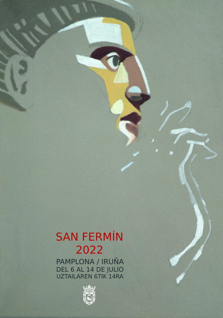
JURY ASSESSMENT
Delicate. Apparently unfinished, as sketched.
Brave in composition and execution.
Of great artistic quality.
Great actuality in the classicism that has the drawing. It is very classic but very modern at the same time.
It provides a great capacity to evoke the light that illuminates a Saint that we recognize immediately despite appearing in that fragmented, sketchy way and without his characteristic attributes of the crozier and mitre.
A very clean work in which the artistic quality stands out within the deliberate simplicity of execution.
ARTIST PERSON COMMENT
The poster extols the figure of the Saint as a light in a void, after two years of absence. The image of him predominates on a neutral background with a slight abstraction of shapes and warm colors.
POSTER 10. WE ARE ALL THE PARTY
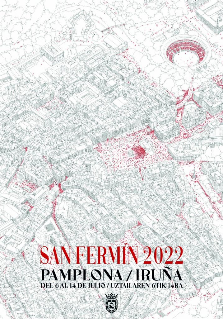
JURY ASSESSMENT
It is a virtuous poster in the handling of infographics.
Beautiful image that evokes those decorative New York plans.
A powerful image in the reality of the urban fabric populated by small elements and festive protagonists. An infographic that talks about people’s experiences and where those “moments” of the party occur. Narrate emotion by putting those red dots scattered around the map.
It provides a brave and very attractive composition, achieved in an image with hardly any color.
ARTIST PERSON COMMENTS
A city designed and inspired by and to contain the party. Joy and celebration shape streets full of color and orchestras. It is much more than 1 week a year, a memory of yesteryear.
601 works presented
Pamplona City Council has registered 601 works submitted to the San Fermín 2022 poster contest. This is the second highest participation in the last 20 years, after the 622 in 2004, also doubling the 245 posters submitted for the festivities held in 2019. of the 601 posters, 188 have been sent from Pamplona, 192 from other towns in Navarra and 206 from Spanish autonomous communities.
